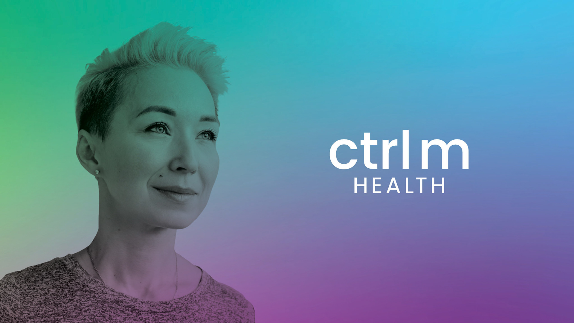
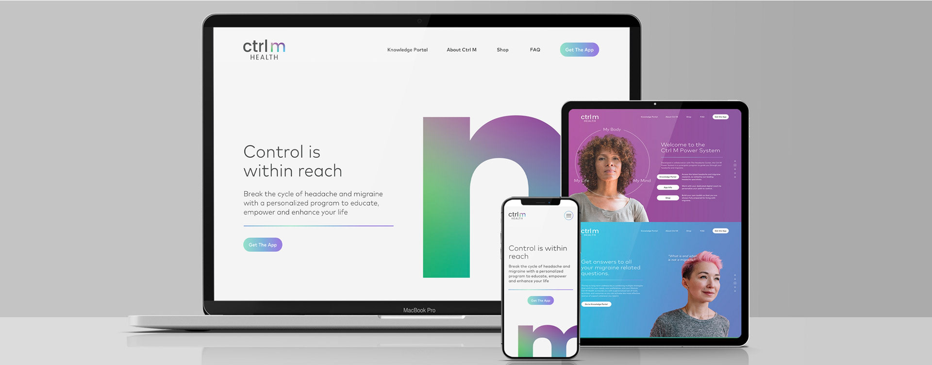
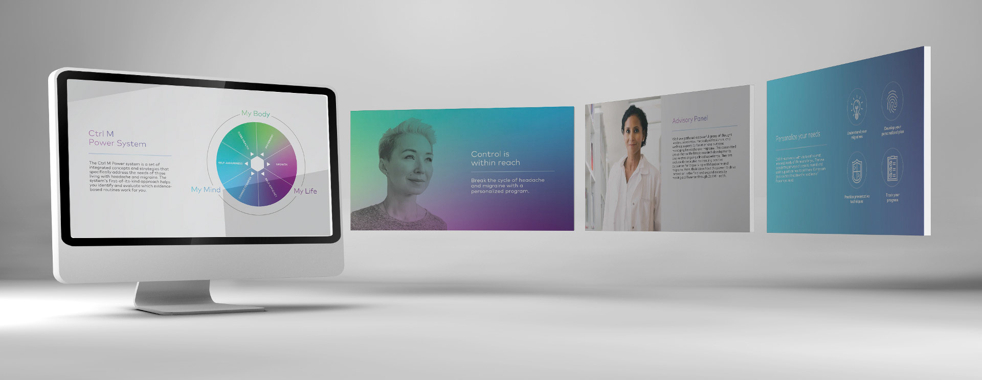
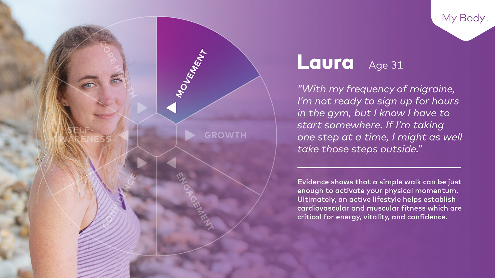
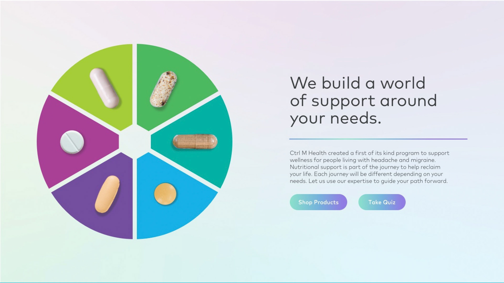
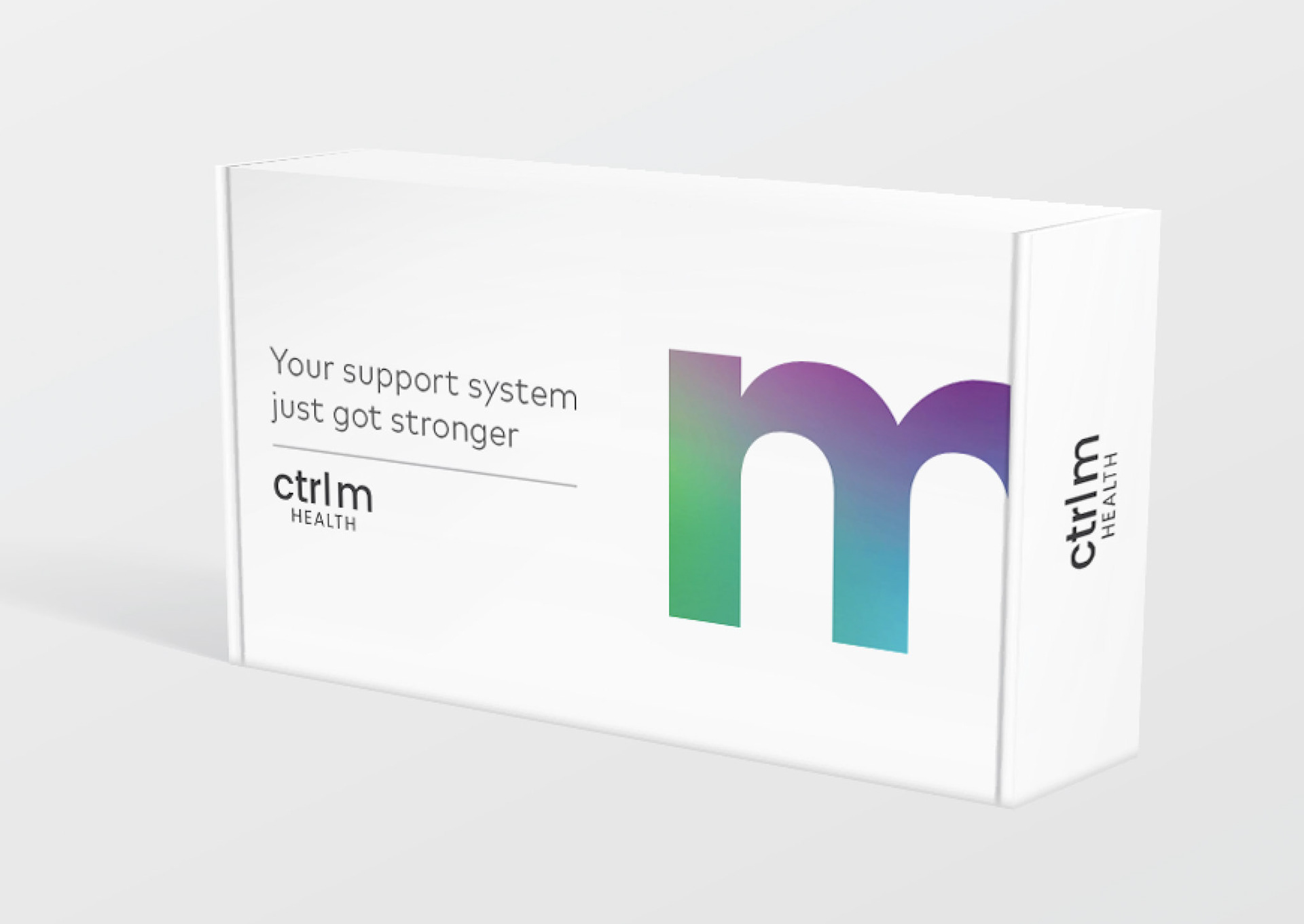
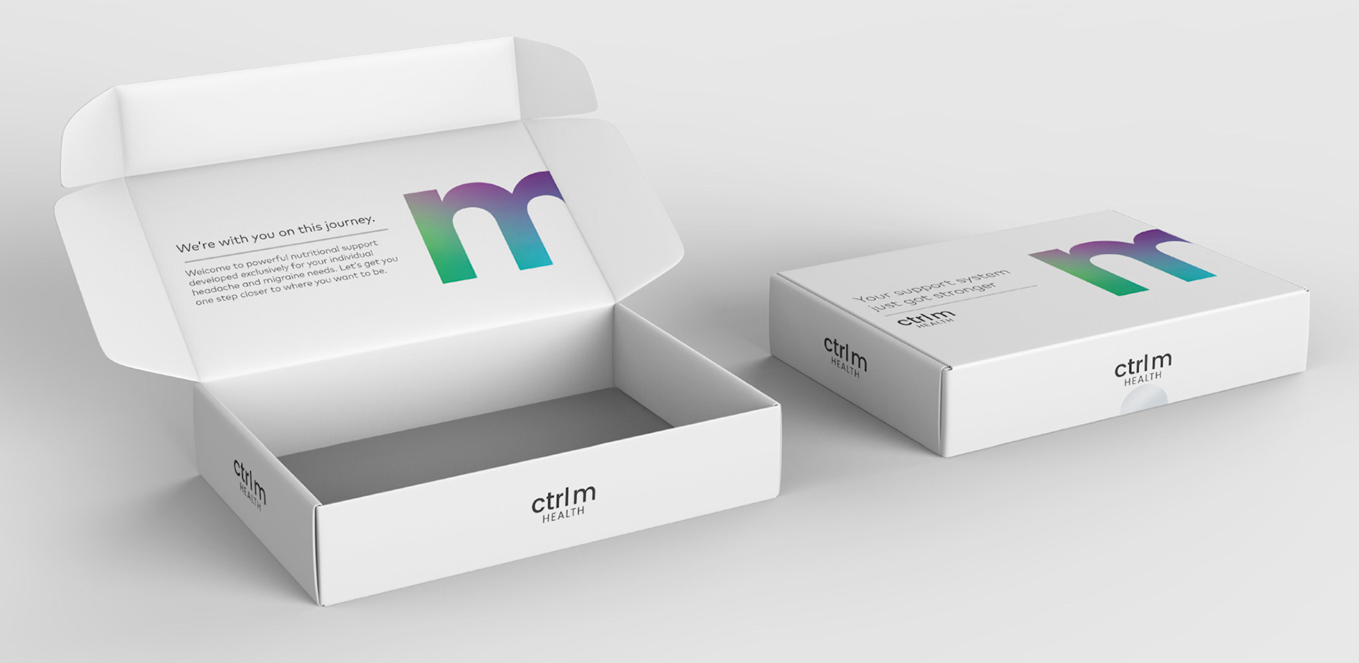
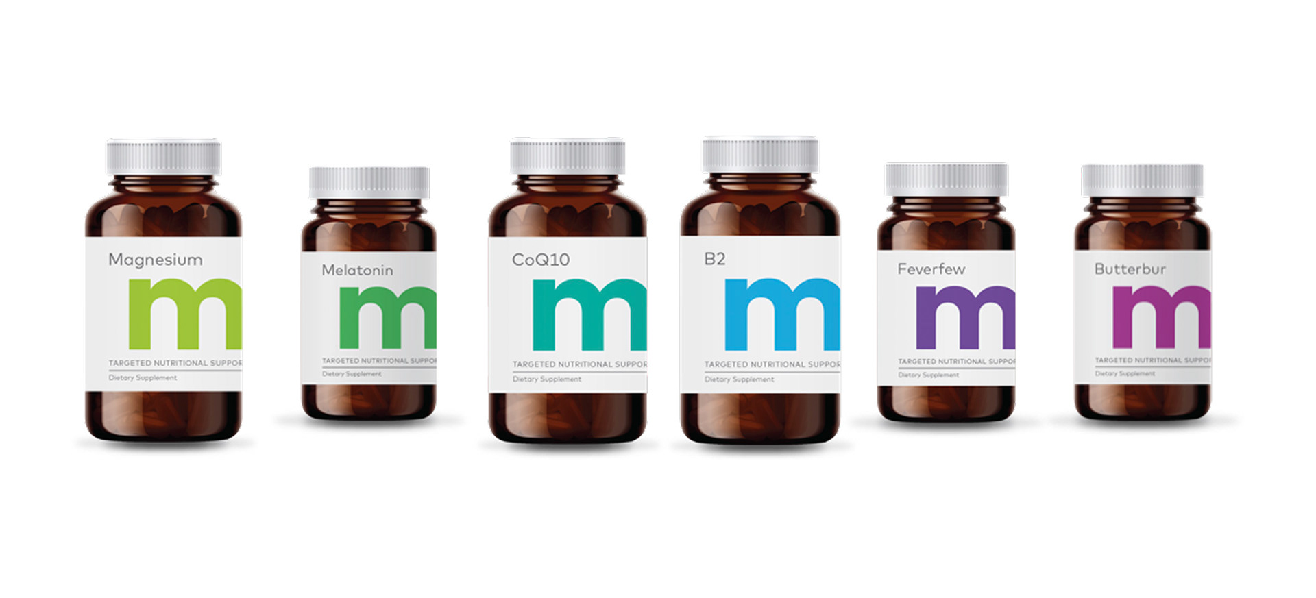
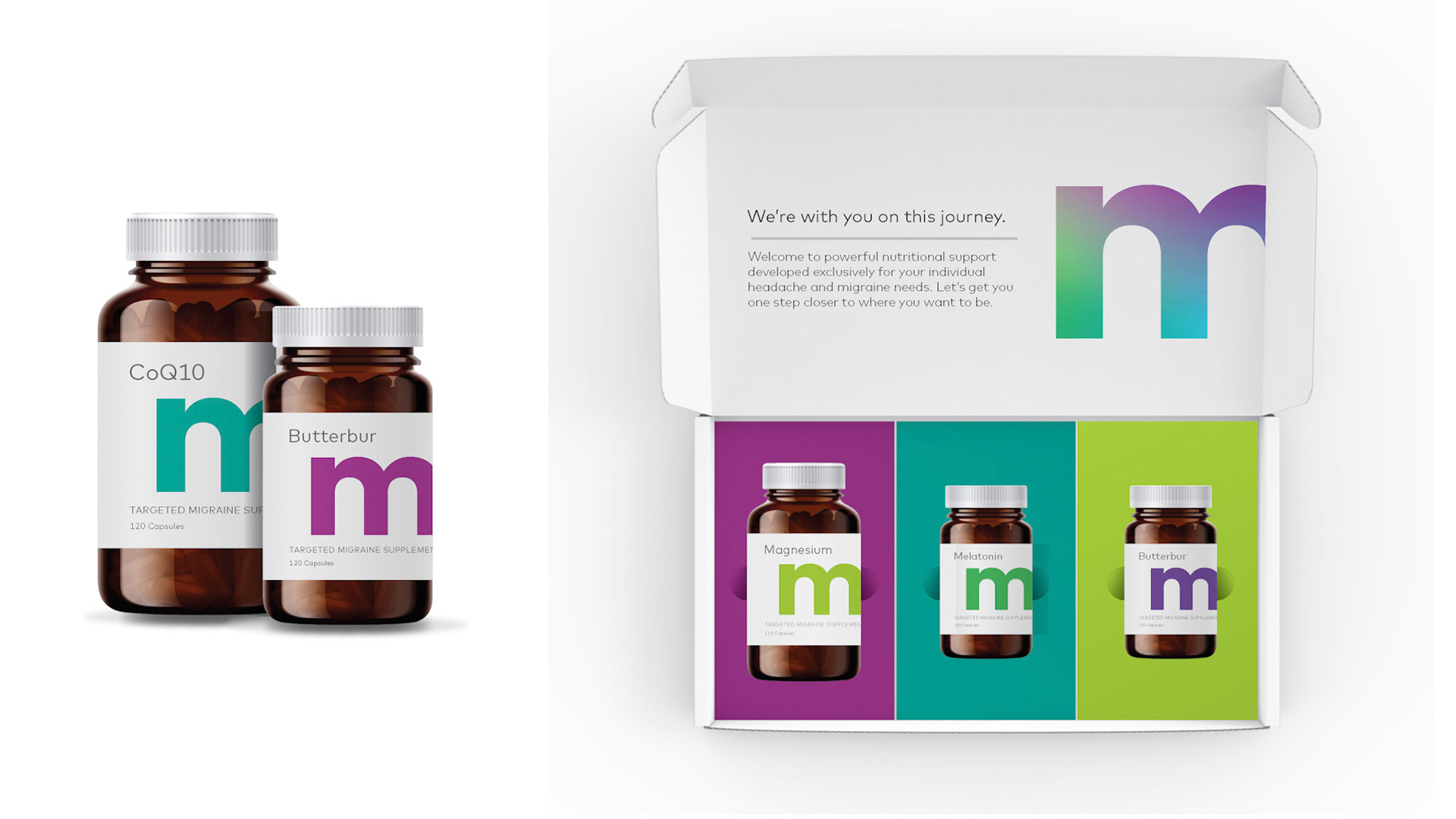
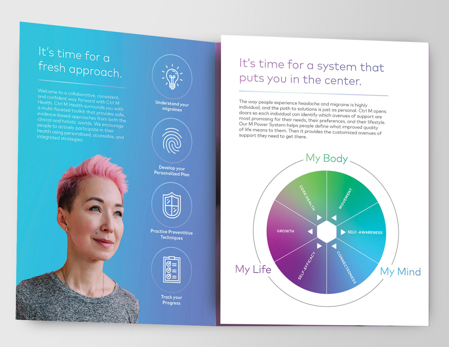
You may also like

aetna It only takes a minute series
2022
It only takes a minute to watch each video. And it only takes a minute to start a vital conversation that could help somebody cope with adversity.
Creative Direction | STORYBOARDING | Script writing | NAMING
Canadian Tire Q convenience store
2022
It all started with a name so simple, it could be expressed with just one letter. The letter “Q” immediately took this emerging brand full circle with its elegant disruptor. Aligning convenience with simplicity was such a pure thought, we built the entire store around this one-letter name, from the floor plan, up—yes, only in Canada can one get away with this. With equity from its Canadian Tire parent brand, Q convenience stores had the freedom to kept things light, spacious, and inviting.
Creative direction | Art direction | DESIGN
franklin farms
2022
Known by the Nature's Soy name within select Asian markets, Keystone Natural Holdings was ready to extend its product reach to mainstream consumers by introducing a modern, plant-based protein brand. Post-acquisition, the “Franklin Farms” brand came to life, with a look and feel that simplified a complex message and unpacked the visual variety within plant-based eating. Veggies spin out into radial patterns, hero-ing actual plant ingredients inside the products. After all, seeing is believing.
Creative direction | Art direction | PackagING Design
five below brand development
2022
From designing the logo to defining the "so not a dollar store" category, I shaped the Five Below brand from the start. In 2002, the previous owners of Zany Brainy toys had a big idea but needed a face for it—so George’s fit the bill. Quickly, Five Below's wild success and sheer volume of cool stuff outgrew the original store design, so I partnered with the brand on Version 2.0 too, adding chaos-busting categories and a fresh take. Today, Five Below has over 1,700 locations and offers an expanded take on buying power that’s still all about the Washingtons.
Creative direction | Art direction | Copywriting | Design
Penn Community Bank
2022
With an unstoppable growth philosophy, Penn Community Bank needed to educate people about how mutual banks make a difference. Neighborhood-inspired gridwork, meaningful iconography, and uplifting imagery connected a full range of campaign materials—including print, video, digital, and out of home. PCB captured additional market share with consumer audiences and commercial clients, and that sparked branch and territory expansion. Cue the "Here We Grow" moments for everyone.
Creative direction | Art direction | Copywriting
Davidson College
2022
To assert their distinctiveness within the close-knit species of elite liberal arts schools, Davidson College needed to elevate the narrative. Differentiated by deeply rooted values and fierce academic rigor, the Davidson experience propels students to engage in a true examination of self and world. Prompted by the most significant research, strategy, and design engagement in Davidson’s history, the #DavidsonTrue campaign created targeted resonance with admissions, development, alumni relations, talent acquisition, athletics, and career center audiences—and, of course, NCAA basketball tournament viewers. We see you, Wildcats!
Creative direction | copywriting | art direction | storyboarding
AmeriGas
2022
As the leading US retail propane supplier, AmeriGas keeps households and enterprises running across the country. But the brand was stuck on "the how"—showing tanker trucks on highways instead of emphasizing the important role AmeriGas plays in the day-to-day lives of customers. Enter propane that’s pro-you. As an organizing principle, external tagline, and creative platform—the pro-you energy shifted the entire brand, placing customers at the center. With a clearly defined brand strategy, AmeriGas built on established strengths while identifying a decisive way forward with a powerful commitment to customer service.
Creative direction | Art direction | Copywriting | Storyboarding
spread bagelry
2022
Hand-crafted bagel, meet hand-crafted brand. With a mighty expansion strategy, Spread faced the challenge of channeling its charm without spreading hospitality thin. Offering a fresh, modern welcome, hand-done illustrations celebrate every nuanced ingredient and honey-boiled step in the Montreal bagel-crafting process. Authentic product shots reveal individual shapes, sizes, and imperfections as proof of a truly original artisanal experience.
Creative direction | brand strategy | Copywriting | Art direction
dansko
2022
Determined to reduce its footprint, Dansko is a footwear brand that treads thoughtfully. With a sustainable overhaul of its headquarters, Dansko carved out a massive outlet location inside its green-roofed, LEED-Gold certified space for the brand to solidify its retail presence. Between poured, polished concrete floors and the elegantly sloped ceiling structure planked with local timbers, every fixture and function used sustainable design materials and methods to establish a retail identity, signage, displays, messaging, and experiential branding.
Creative direction | Art direction | Copywriting | DESIGN
koffman wedding invite
2022
The Koffmans enlisted their guests to help them tie the knot.
MATRIMONY | DESIGN
Back to Top